Krispy Kreme
At a glance
| Interior Design | Path Design |
| Electrical Consultants | Into Electrical |
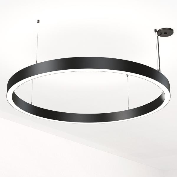
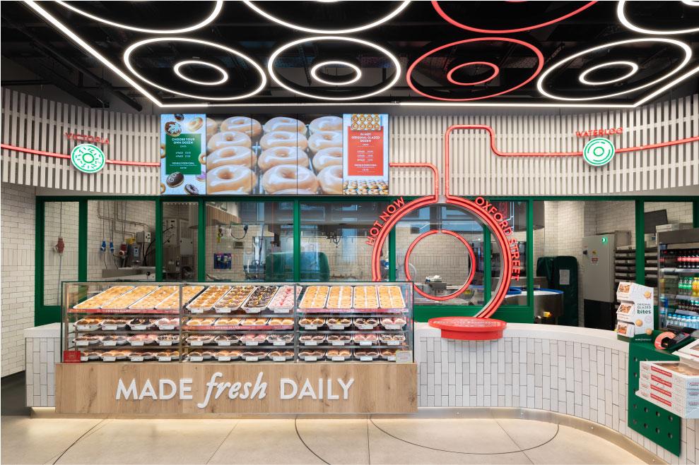
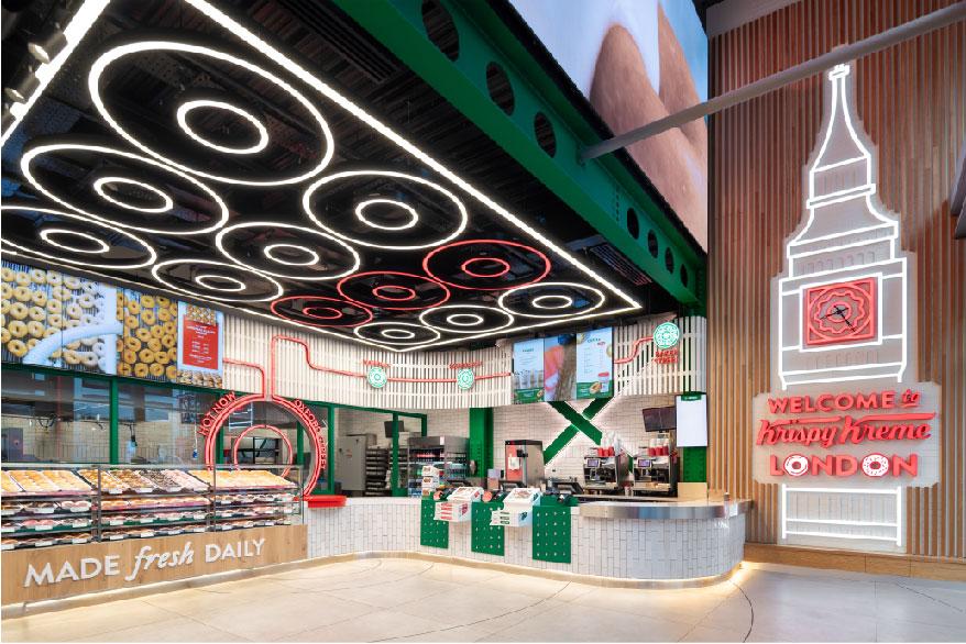
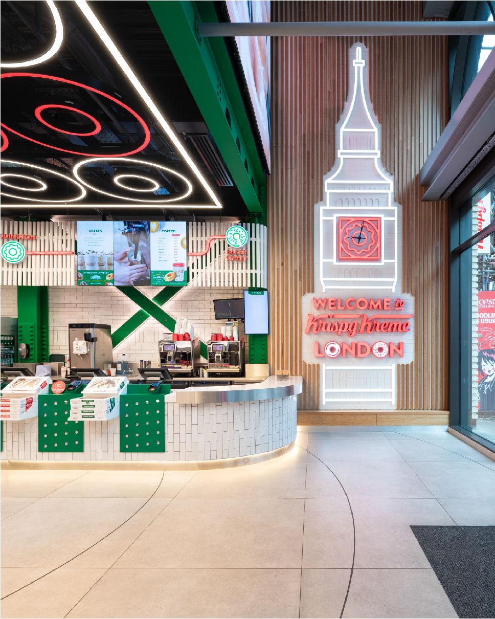
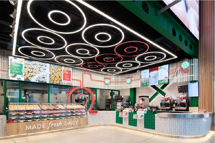
For Krispy Kreme’s design in the West End, its 22nd London location, the brief was to create a number of rings to suspend as the main lighting feature. The lighting perfectly mirrors the doughnut shape and highlights the brand’s highly anticipated Hotlight experience, giving fans in Central London the chance to experience fresh Original Glazed Doughnuts off the line for the first time.
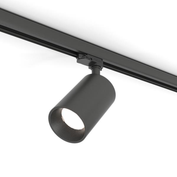
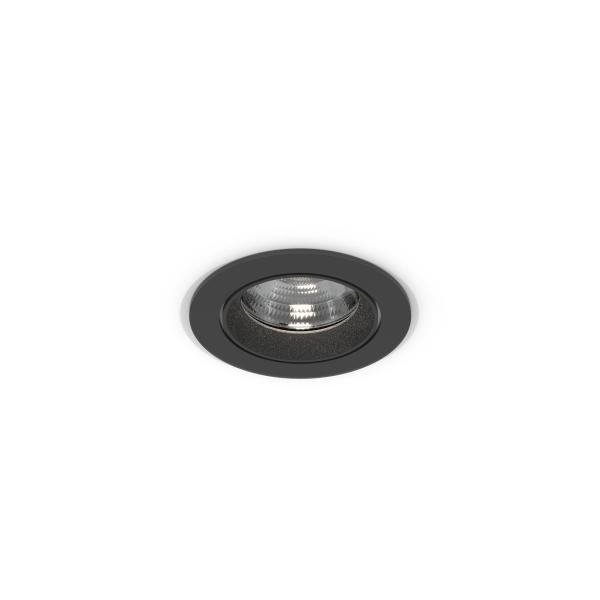
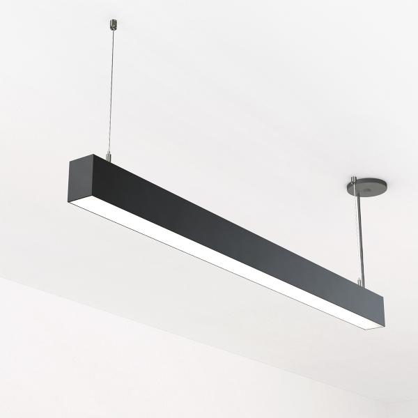
Light Forms worked closely with the Interior Designers Path Design, and Electrical Contractors Into Electrical, to create bespoke rings and an outer rectangle that worked to the millimetre in the space, ensuring that the lighting fitted perfectly within the shop area. A range of Light Forms fixtures were used to achieve this bespoke design - Lightplane 2.5, a streamlined luminaire, MoonBand 40, a narrow-suspended ring, the Nova 93 track spot, and the Carina 115 ceiling recessed downlight. The main challenge for the teams was to ensure that the fixtures were to the exact size specification to fit into the space and create the desired effect.
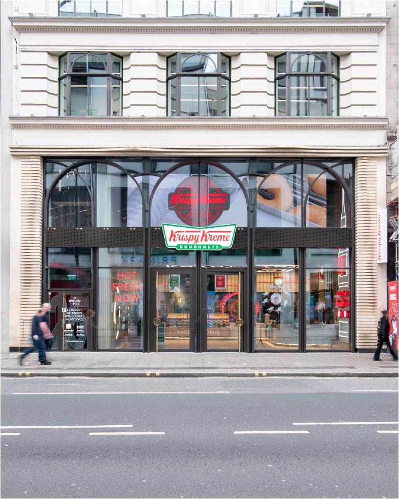
The result is that the 1,534 square foot space has been transformed into a showstopping display to inspire both customers and staff, standing out from the pavement and drawing the eye of those outside. The circular rings hang above the shop floor, enticing customers by emulating perfectly the doughnut’s shape and alerting customers with a red light to the fact that the Hotlight experience is in session - making the brand instantly more recognisable and matching the aesthetic of its other stores.
